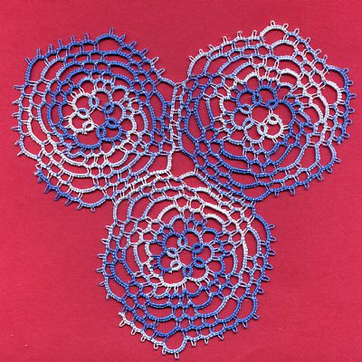
#9 and #10: Familiarity breeds contempt
I was unhappy with how difficulty it was to see the overall pattern with the one “Whirligig” motif in the last post. So I made two more. Unfortunately, I don’t think it’s any easier to see it now. I may have miscalculated by putting the tatting on the red background; I thought that the white part of the variegated thread might show up better on a dark color. But looking back at the original single motif, I think it shows up better on the yellow.
Looks like I’m going to have to keep making these in order to have any chance at creating the desired effect. Luckily I enjoy making them.
Explore posts in the same categories: Tatting
October 20, 2006 at 1:02 pm
I don’t think it’s the background so much as it’s the variegated thread. Colour changes can distract the eye from seeing the design of the thread.
October 20, 2006 at 9:16 pm
Beautiful tatting!
Sharon is right varigated thread pulls the attention away from the design pattern to the color pattern. Also look at the book’s photo, see how tiny the picots are, it helps show off the windmill swirl.
October 25, 2006 at 7:41 am
Hi Donna,
I hope the comments didn’t discourage you. Your tatting is so beautiful.
I have drooled over both of the Mary Konior’s windmills but have never attempted them. Her books are my favorites too.