Saturday was a blank canvas. Noel away at a film festival, Archer away at a Quiz Bowl tournament, Cady Gray happily engaged in her own activities. I got out my crock pots and the 14 balls of yarn that were stored with them — yarn with beautiful fibers but disappointing colors. Yarn that wasn’t quite a blank canvas, but still invited scribbling.
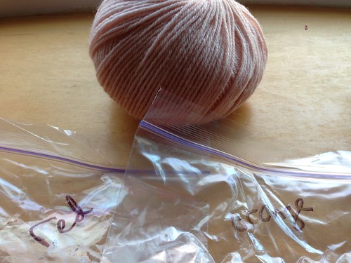
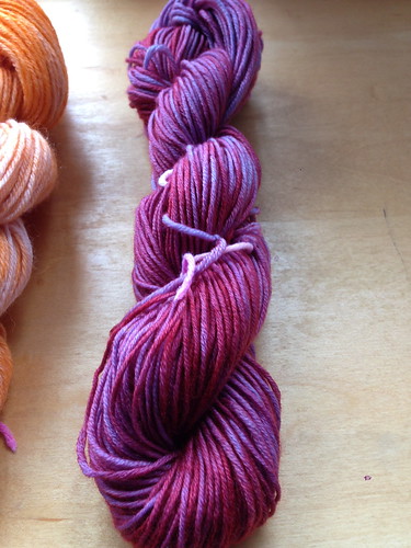
I started with a plan, and took some photos to keep it in mind. This pale pink color of silk/merino blend, called “Blush,” I thought I’d overdye in red and orange.
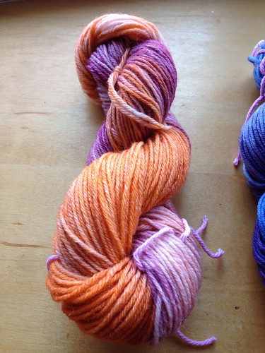
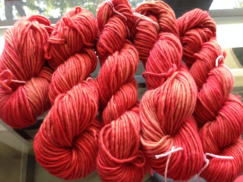
Hm. Not what I was expecting the red dye to do — it’s a purplish rust. But the orange, now, that was orange. Maybe all orange from here on out.
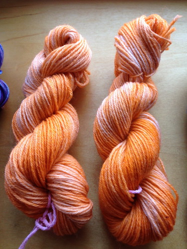
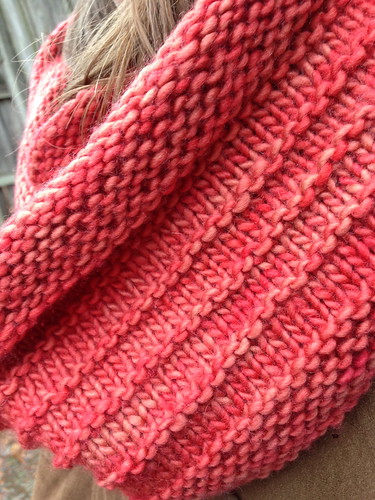
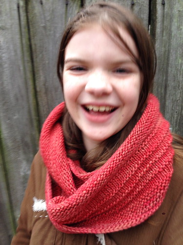
Ah yes. Much better.
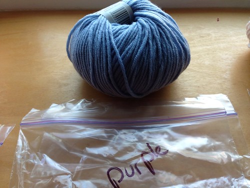
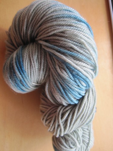
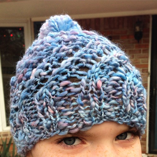
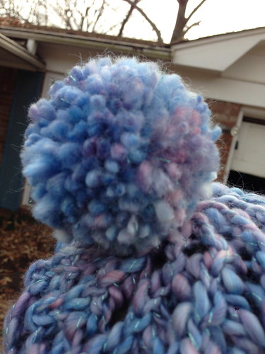
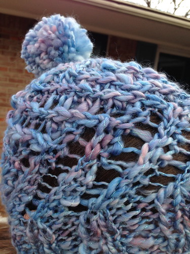
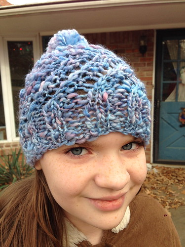
You know, there’s nothing really wrong with these 100% merino balls in this shade of blue. It’s just … not the kind of blue that lights my fire. It’s kind of a safe blue. A boring blue. I thought I might try to deepen it with blue and purple overdyeing.
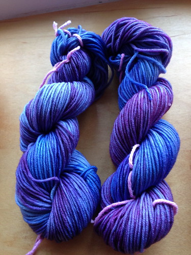
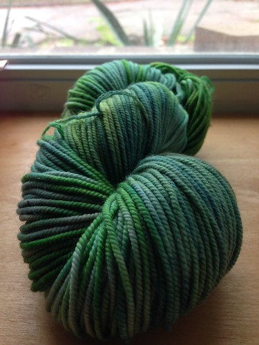
Just what I had in mind.
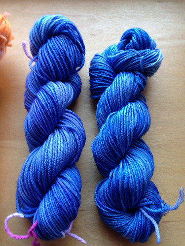
When I dropped the dye tablets for the third skein, they were all blue — no purple. Identifying these Easter egg dyes from the tablet appearance is a terribly inexact science — red, blue, and purple can look very much alike. Huh. I think I’ll run with it.
But just to swing the pendulum the other way before I’m done, let me use all red on one of these blue skeins, see what happens. I thought I hated this when it first came out, but now it’s growing on me.
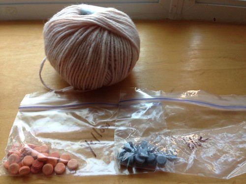
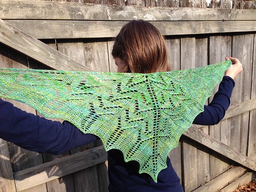
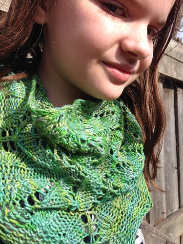
For these last four balls of even paler peach — barely-tinted, really) — silk-merino blend, in a bulky weight this time, I thought I’d try to mix the dyes a little more, get some blended green out of yellow and blue.
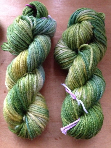
Uh-huh, kinda like that. There were several places that were the original color after the first dyeing, so I overdyed these with an additional coat of yellow.
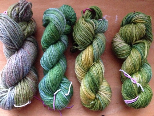
For the one second from left, the original blue in the blend was the PAAS “teal” shade, and I added an overwash of “denim” at the end. And in the weird sage-shades one on the far left, the blue was PAAS “denim” color throughout, resulting in a much more muted green that was toned down even further by the final wash in blue.
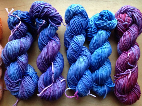
If you asked which group looks more like yarn I’d be attracted to on the shelf or in an online photo, it’s definitely the blue group.
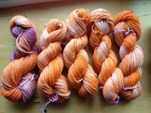
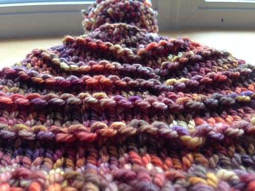
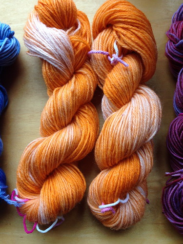
But these Creamsicle skeins, even though they’re far from something I’d reach for when buying yarn, are the ones that intrigue me the most. I keep thinking about how I might use them. They present a challenge — a lovely challenge.